 |  |

| |
The CSS-Positioning recommendation specifies several properties that can be set as style sheet rule attributes. These attributes are used only when the position attribute is included in the rule; otherwise they have no meaning. Table 4-1 provides a summary of position-related style attributes defined in the W3C recommendation. They are all implemented in Version 4 browsers and later (but not all attribute values are supported in early versions).
|
CSS attribute |
Description |
|---|---|
| position |
Defines a style rule as being for a positionable element |
| top |
The offset distance from the top edge of the element's positioning context to the top edge of the element's box |
| right |
The offset distance from the right edge of the element's positioning context to the right edge of the element's box |
| bottom |
The offset distance from the bottom edge of the element's positioning context to the bottom edge of the element's box |
| left |
The offset distance from the left edge of the element's positioning context to the left edge of the element's box |
| clip |
The shape and dimension of the viewable area of an absolute-positioned element |
| overflow |
How to handle content that exceeds its height/width settings |
| visibility |
Whether a positionable element is visible or not |
| z-index |
The stacking order of a positionable element |
Of the five values available for the position attribute, only the value fixed requires a recent browser (Opera 5, Netscape 6, and IE 5/Mac but not IE for Windows through Version 6). The default value is static, meaning that elements by default render in their normal content flow.
Four edge measurement attributes deal with lengths, whether they are for positioning of the element or determining its physical dimensions on the page. Recall from Chapter 3 (Figure 3-2) that height and width attributes refer to the size of the content, exclusive of any padding, borders, or margins assigned to the element (only in standards-compatible mode in IE 6 for Windows). The top, right, bottom, and left values, however, apply to the location of the box edges (content + padding + border + margin). The measures are relative to the respective edges of the positioning context. Therefore you can set the width of a positioned element by specifying a width attribute or by setting both the left and right attributes.
When assigning a value to a CSS length-related attribute, you can do so as a fixed length or a percentage. Fixed-length unit syntax is shown in Table 4-2. Percentage values are specified with an optional + or - symbol, a number, and a % symbol. Percentage values are applied to the parent element's value.
|
Length unit |
Example |
Description |
|---|---|---|
| em | 1.5em |
Element's font height |
| ex | 1ex |
Element's font x-height |
| px | 14px |
Pixel (precise length depends on the display device) |
| in | 0.75in |
Inch (absolute measure) |
| cm | 5cm |
Centimeter (absolute measure) |
| mm | 55mm |
Millimeter (absolute measure) |
| pt | 10pt |
Point (equal to 1/72 of an inch) |
| pc | 1.5pc |
Pica (equivalent to 12 points) |
The length unit you choose should be based on the primary output device for the document. Most HTML pages are designed for output solely on a video display, so the pixel unit is most commonly used for length measures. But if you intend your output to be printed, you may obtain more accurate placement and relative alignment of elements if you use one of the absolute units: inch, centimeter, millimeter, point, or pica. Print quality also depends on the quality of the printing engine built into the browser. The CSS2 @media rule, when supported, allows you to define style rules customized for a variety of output devices.
Indiscriminately positioning deeply nested elements may result in unexpected and undesirable effects in many browsers. For example, style settings could position a block beyond the browser's window content region while the browser fails to provide scrollbars for the user to reach those elements. You can experiment with this by removing the right and width style attributes from the example shown in Figure 4-5 and resize the window to force the dangling text offscreen to the right on most browsers.
A clipping region is a geometric area (currently limited to rectangles) through which you can see a positioned element's content. For example, if you include an image in a document, but want only a small rectangular segment of the whole image to appear, you can set the clip attribute of the element to limit the viewable area of the image to that smaller rectangle. It is important to remember that the element does not shrink in overall size (scale) for the purposes of document flow, but any area that is beyond the clipping rectangle becomes transparent, allowing elements below it in the stack to show through. If you want to position the viewable, clipped region so that it appears without a transparent border, you must position the entire element (whose top left corner still governs the element's position in the grid). Similarly, because the clipping region encompasses viewable items such as borders, you must nest a clipped image inside another element that sets its own border.
Figure 4-6 demonstrates (in three stages) the concept of a clipping region relative to an image. It also shows how positioning a clipped view requires setting the location of the element based on the element's original size.
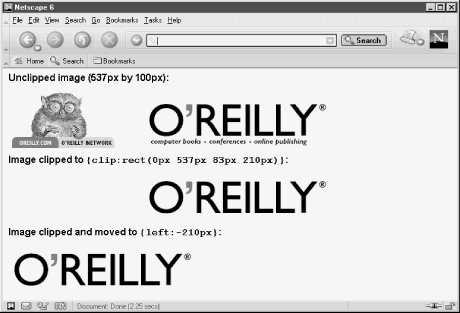
Setting the values for a clip region requires slightly different thinking from how you might otherwise describe the points of a rectangle. The clip attribute includes a shape and four numeric values in the sequence of top, right, bottom, left—the same clockwise sequence used by CSS to assign values to edge-related attributes (borders, padding, and margins) of block-level elements. Moreover, the values are entered as a space-delimited sequence of values in this format:
clip:rect(top right bottom left)
In Figure 4-6, the goal is to crop out the critter, tabs, and tagline from the image and align the clipped image to the left. The original image (537 by 100 pixels) is at the top. To trim the unwanted portion requires bringing in the left clip edge 210 pixels. The bottom tag line is also clipped for a height of 83 pixels:
<img src="oraImage.gif" height="100" width="537" style="position:absolute;
clip:rect(0px 537px 83px 210px)">
Then, to reposition this image so that the clipped area abuts the left edge of its positioning context, the style rule for the element must assign a negative value to take up the slack of the now masked space:
<img src="oraImage.gif" height="100" width="537" style="position:absolute;
left:-210px; clip:rect(0px 537px 83px 210px)">
Although first defined for CSS-P, the overflow attribute has broader application in CSS2. The attribute controls how content nested inside a fixed-size block is to be displayed if the content exceeds the physical boundaries of the container. The positioning aspect comes from the possibility of positioning a nested element anywhere within a fixed-size container. Should "overflow" content be cropped by the container's edges, or should the content bleed beyond the container's edges? That's what the overflow attribute controls via its possible settings of visible, hidden, and scroll.
When you set overflow to hidden, the excess content is cropped; when set to visible (the default), all excess content is visible. Unfortunately, the implementation of the visible value is not the same in IE compared against other browsers. Consider the following document fragment, which affects how much of the upper left corner of an image appears in the browser window:
<span style="position:relative; width:50px; height:50px; overflow:visible;
border:5px solid red">
<img src="myImage.gif" height="90" width="120">
</span>
In the previous example, even though the width and height style attributes are set for a span wrapper around an image, the natural width and height of the image force IE browsers to expand the box (and thus the dimensions) of the span element to encompass the image. In other browsers, the span's size and box remain fixed while the image bleeds to its own edges. This latter behavior is prescribed by the CSS2 standard.
IE 4 and later and Netscape 6 also support the scroll value. This setting automatically displays scrollbars inside the clipped rectangle defined by the positioned element's height and width attributes. Content is clipped to the remaining visible space; the user clicks or drags the scrollbars to maneuver through the content (image or text). When overflow is set to scroll, a full set of scrollbars appear, even if one axis doesn't require scrolling. IE also provides axis-specific attributes (overflow-x and overflow-y) to help you limit which axis gets the scrollbar.
The purpose of the visibility attribute is obvious: it makes an element visible or hidden. Unless the element is under script control, however, it is unlikely that you would bother setting the attribute's value (to inherit, visible, or hidden). There is rarely a need to load a normally visible HTML element into a page as hidden, unless you also have a script that changes its state as the user visits the page—perhaps in response to mouse clicks or a timed event.
It is, however, important to understand the difference between setting a positionable element's visibility attribute and setting the CSS display attribute to none. When a positionable element is set to be hidden, the space occupied by the element—whether it is a position in the stacking order or the location for flowed content set off as a relative-positioned element—does not go away. If you hide a relative-positioned element that happens to be an emphasized chunk of text within a sentence, the rest of the sentence text does not close up when the positioned portion is hidden.
In contrast, if you set the CSS attribute of an element to display:none, the browser ignores the element as it flows the document. Changing the display attribute under script control causes the content to reflow. This is how some DHTML-driven collapsible menus are created and controlled.
Positioned elements can overlap each other. While overlapping text doesn't usually make for a good page design, overlapping opaque elements, such as images and blocks with backgrounds, can be put to good use, particularly when the elements are under script control. The z-index attribute lets you direct the stacking order (also called the z-order, where Z stands for the third dimension, after X and Y) of elements within a positioning context. The higher the z-index value (values are integers), the closer the element layer is to the user's eye.
Positioned elements—even if their z-index attributes are not specified in their style rules—exist as a group in a plane closer to the user's eye than nonpositioned content. Notable exceptions to this rule are form controls, such as select lists, which some browsers always render in front of all other content, no matter what you do.
If you do not specify the z-index attribute for any positioned elements in a document (implying a default value of zero), the default stacking order is based on the sequence in which the positioned elements are defined in the HTML source code. Even so, these positioned items are in front of nonpositioned items (except as noted above). Therefore, you need to specify z-index values only when the desired stacking order is other than the natural sequence of elements in the source code.
More commonly, z-index values are adjusted by scripts when a user interacts with maneuverable content (by dragging or resizing), or when a script moves an element as a form of animation. For example, if your page allows dragging of elements (perhaps an image acting as a piece of a jigsaw puzzle), it may be valuable to set the z-index attribute of that element to an arbitrarily high value as the user drags the image. This keeps the image in front of all other positionable puzzle pieces while being dragged (so it doesn't "submarine" and get lost behind other elements). When the user releases the piece, you can reset the z-index attribute to, say, zero to move it back among the pool of other inactive positioned elements.
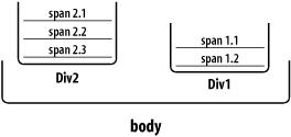
You cannot interleave elements that belong to different positioning contexts. This is because z-index values are relative only to sibling elements. For example, imagine you have two positioned div elements named Div1 and Div2 (see Figure 4-7). Div1 contains two positioned span elements; Div2 contains three positioned span elements. A script can adjust the z-index values of the elements in Div1 all they want, but the two elements are always kept together; similarly, the three elements in Div2 are always "contiguous" in their stacking order. If you swap the z-index values of Div1 and Div2, the group of elements contained by each div swaps positions as well.
|  | |
| 4. Adding Dynamic Positioning to Documents |  | 4.3. Changing Attribute Values via Scripting |

Copyright © 2003 O'Reilly & Associates. All rights reserved.